Documentation
Noveo
Thank you so much for purchasing our item from themeforest.
This section will guide you through the basic setup and structure of the theme, helping you get started quickly and easily.
- Version: 1.0
- Author: PioneerPixel
- Created: 12 January, 2026
If you have any questions that are beyond the scope of this help file, Please feel free to email via Support mail.
Installation
Getting started with the theme is straightforward and does not require any special setup. Follow the steps below to setup your site template:
- Unzip the downloaded package
- Open the noveo-html-template-v-1.0.0 folder to find all the template files. You will need to upload these files to your hosting web server using FTP or local server (recommended, e.g. XAMPP, MAMP) in order to use it on your website.
- You are good to go for adding your content now!
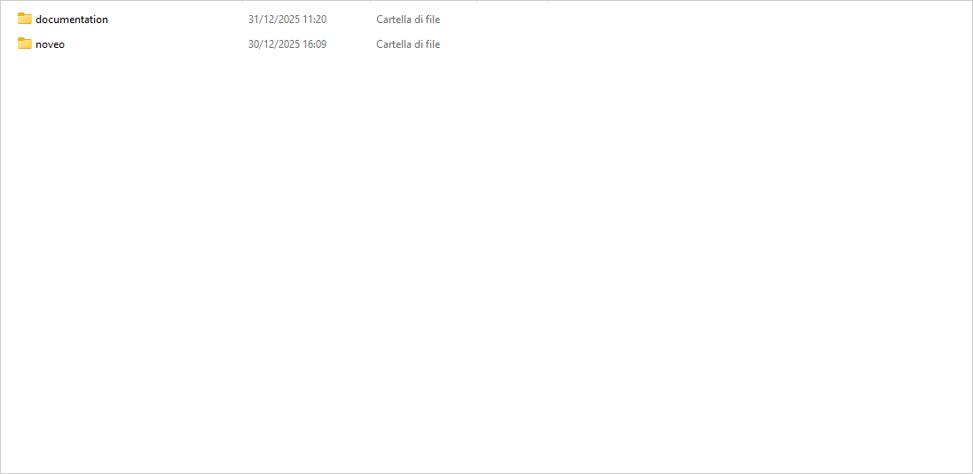
Folder structure overview (root folder with noveo/ and documentation/).
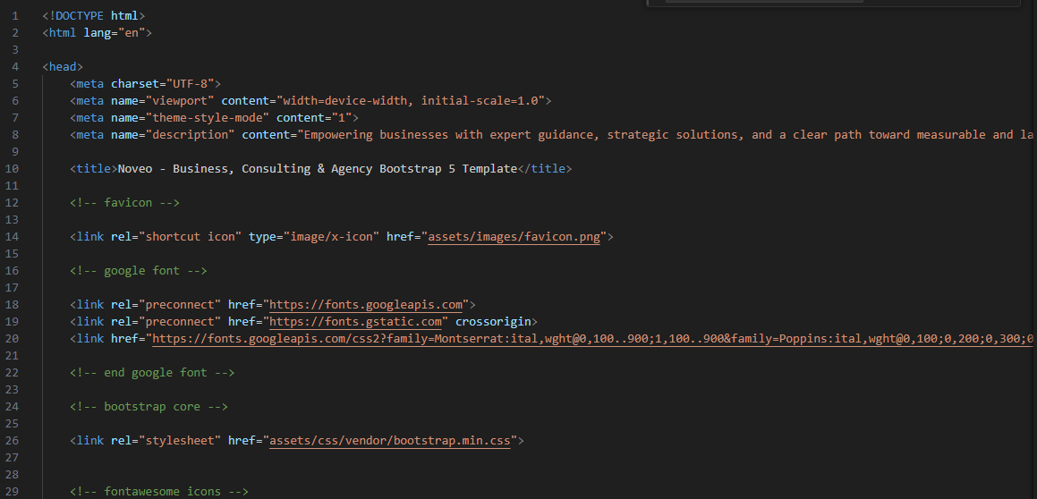
HTML Structure
The theme is built with a clean and well-organized HTML structure based on reusable sections.
The template is based on Bootstrap Framework
<!DOCTYPE html>
<html lang="en">
<head>
    <meta charset="UTF-8">
    <meta name="viewport" content="width=device-width, initial-scale=1.0">
    <meta name="theme-style-mode" content="1">
    <meta name="description" content="Empowering businesses with expert guidance, strategic solutions, and a clear path toward measurable and lasting results.">

    <title>Noveo - Business, Consulting & Agency Bootstrap 5 Template</title>

    <!-- favicon -->

    <link rel="shortcut icon" type="image/x-icon" href="assets/images/favicon.png">

    <!-- google font -->

    <link rel="preconnect" href="https://fonts.googleapis.com">
    <link rel="preconnect" href="https://fonts.gstatic.com" crossorigin>
    <link href="https://fonts.googleapis.com/css2?family=Montserrat:ital,wght@0,100..900;1,100..900&family=Poppins:ital,wght@0,100;0,200;0,300;0,400;0,500;0,600;0,700;0,800;0,900;1,100;1,200;1,300;1,400;1,500;1,600;1,700;1,800;1,900&display=swap" rel="stylesheet">

    <!-- end google font -->

    <!-- bootstrap core -->

    <link rel="stylesheet" href="assets/css/vendor/bootstrap.min.css">


    <!-- fontawesome icons -->

    <link rel="stylesheet" href="assets/css/plugin/fontawesome.min.css">
    <link rel="stylesheet" href="assets/css/plugin/solid.min.css">
    <link rel="stylesheet" href="assets/css/plugin/regular.min.css">
    <link rel="stylesheet" href="assets/css/plugin/brands.min.css">

    <!-- end fontawesome icons -->

    <link rel="stylesheet" href="assets/css/plugin/swiper-bundle.min.css">
    <link rel="stylesheet" href="assets/css/plugin/animate.min.css">
    <link rel="stylesheet" href="assets/css/style.css">

</head>
<body>

    <!-- start header -->

    <header class="header-default">
     ......
    </head>

    <!-- end header -->

    <!-- start main content -->

    <main>
     ......
    </main id="main-content">

    <!-- end main content -->

    <!-- start footer -->

    <footer>
     ......
    </footer>

    <!-- end footer -->

    <!-- JS -->

    <script src="assets/js/plugin/jquery.min.js"></script>
    <script src="assets/js/vendor/bootstrap.min.js"></script>
    <script src="assets/js/plugin/swiper-bundle.min.js"></script>
    <script src="assets/js/plugin/wow.min.js"></script>
    <script src="assets/js/plugin/isotope.pkgd.min.js"></script>
    <script>
        new WOW().init();
    </script>
    <script src="assets/js/main.js" defer></script>


</body>
</html>
SCSS / Sass Overview
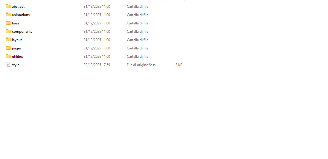
The theme styles are written in Sass (SCSS syntax) for better scalability and maintainability. We have added .scss files in template.
You can find scss file here - assets/scss
- Variables, mixins, and components are separated into dedicated files.
- The main SCSS file compiles into a single
style.cssfile used by the theme.
Open the scss/abstract/_variables.scss and Edit the values according to your needs.
This setup allows easy global changes without touching individual CSS rules.
Screenshot suggestion:
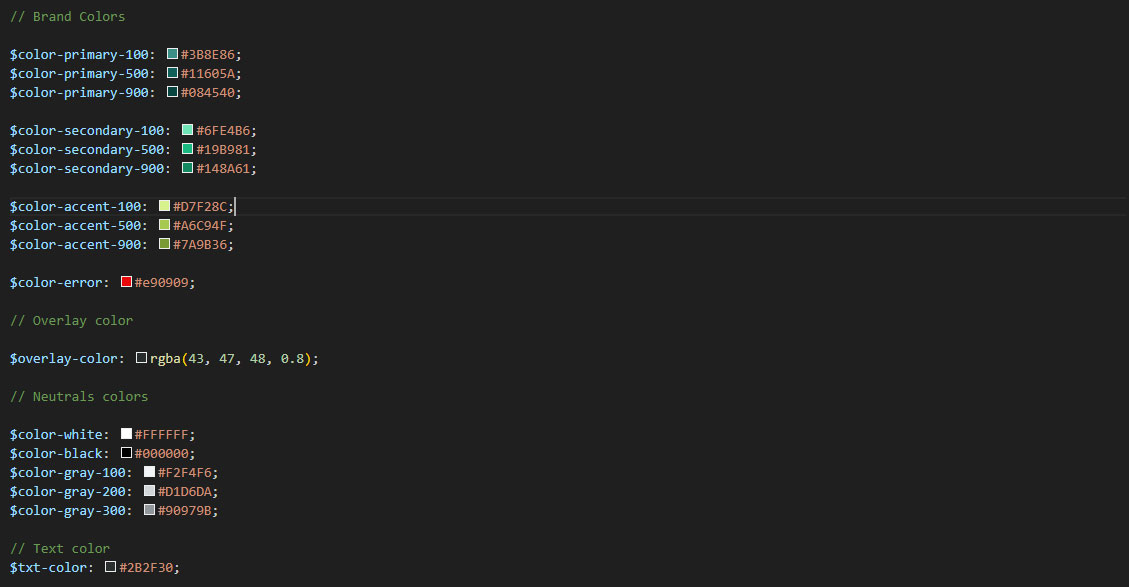
Color Schemes
All colors are managed through Sass variables, making customization fast and consistent across the entire theme.
Brand Colors
$color-primary-100: #3B8E86;$color-primary-500: #11605A;$color-primary-900: #084540;$color-secondary-100: #6FE4B6;$color-secondary-500: #19B981;$color-secondary-900: #148A61;$color-accent-100: #D7F28C;$color-accent-500: #A6C94F;$color-accent-900: #7A9B36;$color-error: #e90909;
Overlay Color
$overlay-color: rgba(43, 47, 48, 0.8);
Neutral Colors
$color-white: #FFFFFF;$color-black: #000000;$color-gray-100: #F2F4F6;$color-gray-200: #D1D6DA;$color-gray-300: #90979B;
Text Color
$txt-color: #2B2F30;
Gradients
$grad-team-1: linear-gradient(135deg, $color-primary-500, $color-primary-100);$grad-team-2: linear-gradient(135deg, $color-secondary-900, $color-secondary-100);$grad-team-3: linear-gradient(135deg, $color-accent-500, $color-accent-100);
To change the color palette, simply edit these variables and recompile the Sass files.
Screenshot suggestion:
Theme Customization
Most visual customizations can be done by editing Sass variables.
You can easily customize:
- Colors
- Border radius
- Typography
- Overlays and gradients
- And more
Example
            $radius-lg: 12px; //default

            $radius-lg: 24px; //custom
After modifying variables, recompile the Sass files to apply changes globally.
Screenshot suggestion:
Logo & Favicon Settings
The Logo Container can be found in the Header - <header> Footer - <footer> and mobile menu - <div class="mobile-menu-header">
            <div class="header-main-logo">
                <div class="logo">
                    <a href="index.html">
                        <img src="assets/images/logo-dark.png" alt="Noveo"/>
                    </a>
                </div>
            </div>

            <div class="mobile-menu-header">
                <div class="logo">
                    <a href="index.html">
                        <img src="assets/images/logo-dark.png" alt="Noveo"/>
                    </a>
                </div>
                ...
            </div>

            <div class="footer-widget">
                <a href="index.html">
                    <img src="assets/images/logo-light.png" class="footer-logo" alt="Noveo"/>
                </a>
                ...
            </div>
Logos are located in the assets folder:
assets/images/To replace the logo:
- Upload your new logo image.
- Keep the same filename
Favicon is located in the assets folder:
assets/images/To replace the Favicon:
- Upload your Favicon.
- Keep the same filename
Content
This section explains how to manage and customize the main content elements used throughout the theme.
Typography
The theme uses Google Fonts, loaded directly in the HTML head.
Google Fonts Setup
  <!-- google font -->

    <link rel="preconnect" href="https://fonts.googleapis.com">
    <link rel="preconnect" href="https://fonts.gstatic.com" crossorigin>
    <link href="https://fonts.googleapis.com/css2?family=Montserrat:ital,wght@0,100..900;1,100..900&family=Poppins:ital,wght@0,100;0,200;0,300;0,400;0,500;0,600;0,700;0,800;0,900;1,100;1,200;1,300;1,400;1,500;1,600;1,700;1,800;1,900&display=swap" rel="stylesheet">

  <!-- end google font -->
To change or add new fonts:
- Visit Google Fonts
- Select your desired font(s)
- Replace or extend the
<link>tag above - Update the font variables in SCSS
Font Variables (SCSS)
  // Font Family

  $font-heading: "Montserrat", sans-serif;
  $font-body: "Poppins", sans-serif;
By changing these variables, all headings and body text will update globally after recompiling the Sass files.
Icons
The theme includes Font Awesome 5 Free, fully integrated and ready to use.
Font Awesome Setup
  <!-- fontawesome icons -->

    <link rel="stylesheet" href="assets/css/plugin/fontawesome.min.css">
    <link rel="stylesheet" href="assets/css/plugin/solid.min.css">
    <link rel="stylesheet" href="assets/css/plugin/regular.min.css">
    <link rel="stylesheet" href="assets/css/plugin/brands.min.css">

  <!-- end fontawesome icons -->
This package includes:
- Solid icons
- Regular icons
- Brand icons (All free icons only)
Reference and icon list:
https://fontawesome.com/v5/search?ic=free-collection
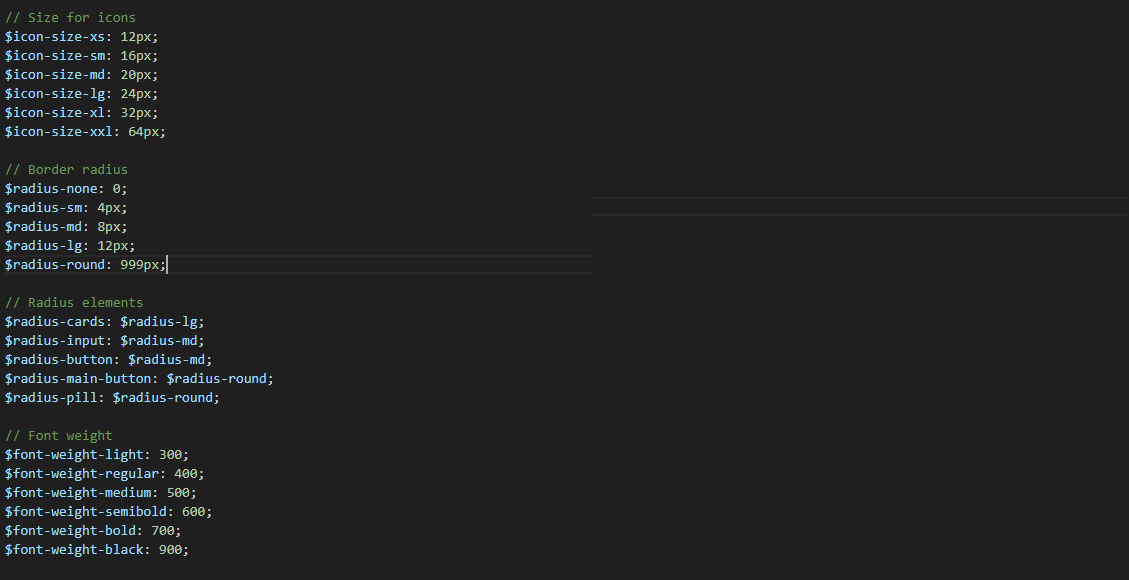
Icon Size Variables
  // Size for icons
  $icon-size-xs: 12px;
  $icon-size-sm: 16px;
  $icon-size-md: 20px;
  $icon-size-lg: 24px;
  $icon-size-xl: 32px;
  $icon-size-xxl: 64px;
These variables can be reused across components or customized to match your design needs.
Images
Preview Images & Copyright
Images shown in the live preview are for demonstration purposes only and are not included in the downloadable package.
The pie chart graphic used in the "Working Process" section in an original design created for this template
The final package contains:
- Placeholder images only
- Each placeholder includes the required image dimensions
This ensures full compliance with copyright and licensing rules.
Customer Logos
Logos used in customer or partner sections are:
- Fully fictional
- Created for illustrative purposes
- Do not represent real companies or brands
Replacing Images
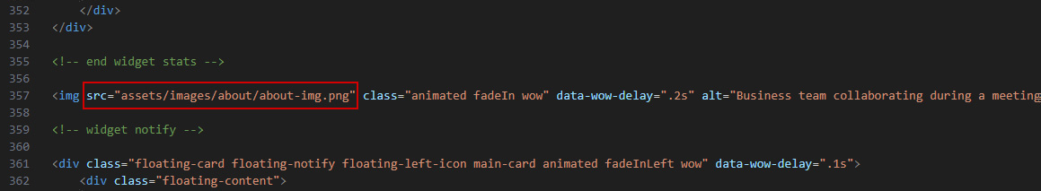
Images can be replaced in two ways:
1. Replace Placeholder Images
Upload your images into the corresponding folders, keeping the same file names:
  assets/images/
  ├─ about/
  ├─ avatar/
  ├─ blog/
  ├─ contact/
  ├─ cta/
  ├─ customers/
  ├─ faq/
  ├─ hero/
  ├─ portfolio/
  ├─ services/
  ├─ team/
  ├─ working-process/
2. Update Image Paths in HTML
You can also change image names, paths, or add new images directly in the HTML files if needed.
Screenshot suggestion:
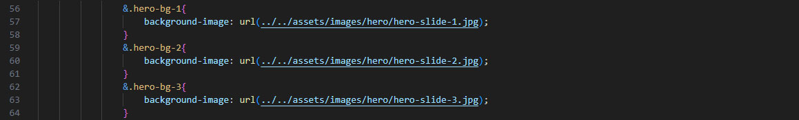
Background Images
Background images (e.g. hero sections) are defined in SCSS files:
background-image: url(../../assets/images/hero/hero-slide-1.jpg);
To change background images:
- Replace the image file or
- Update the image path in the SCSS file
- Recompile the Sass files
Screenshot suggestion:
Notes
- All icons used are Font Awesome 5 Free
- No Pro or premium assets are included
- All placeholder images are safe to replace
- No third-party copyrighted images are distributed
Components
This section describes the main reusable components included in the theme and explains how to customize or extend them.
Buttons

The theme includes three main button styles:
Primary Button
<a class="main-btn main-btn-primary">...</a>
Outline Button
<a class="main-btn main-btn-outline">...</a>
White Button
<a class="main-btn main-btn-white">...</a>
Each button supports:
- Icon + text
- Hover animations
Hero Slide
The Hero Slide is built using Swiper.js and supports unlimited slides.
Each slide follows the structure below:
  <div class="swiper-slide swiper-hero-item hero-bg-1">
    ...
  </div>
Key points
You can add or remove slides freely by duplicating or removing .swiper-slide elements.
Background images are controlled via utility classes:
- hero-bg-1
- hero-bg-2
- hero-bg-3
These classes are mapped to background images inside the Hero SCSS file.
Screenshot suggestion:
To change a background:
- Replace the image inside assets/images/hero/
- Or edit the background image path directly in hero.scss
Floating Cards
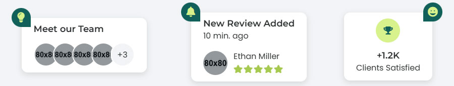
Floating Cards are decorative UI widgets used to highlight dynamic information such as:
- Team members
- Statistics
- Notifications
Available types
- Team widget
- Stats widget (animated counter)
- Notification widget
Each card uses the base class:
<div class="floating-card main-card"></div>
Icon position
You can control the icon direction using:
- floating-left-icon
- floating-right-icon
Example use cases:
- Team preview with avatars
- Animated statistics (clients satisfied)
- Review or activity notifications
Content, icons, avatars, and text can be freely customized by editing the HTML.
Portfolio Filter (Isotope)
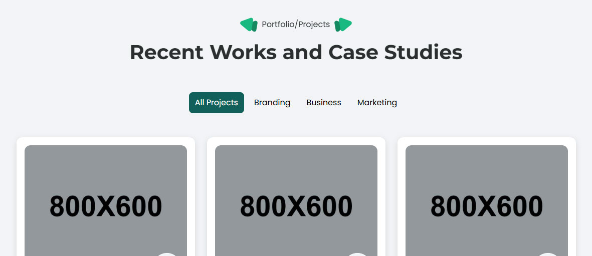
The portfolio gallery uses Isotope js for filtering and layout.
Filters
Each filter button uses the data-filter attribute:
<button data-filter=".branding">Branding</button>
Portfolio items
Each card must include category classes:
<div class="grid-item branding marketing"></div>
How it works
- Filters are defined via data-filter
- Portfolio items respond based on matching CSS classes
- You can add new categories by:
- Adding a new filter button
- Assigning the same class to portfolio items
No JavaScript changes are required.
Working Process
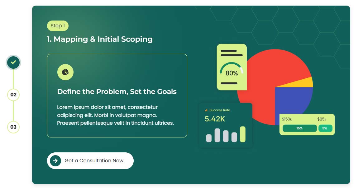
The Working Process component is fully dynamic and scalable.
It consists of:
- A navigation bar (steps)
- Matching content cards
Navigation
Each step button uses:
<button class="step-nav-item" data-step="1"></button>
Content
Each step content block uses the same data-step value:
<div class="working-step-item" data-step="1"></div>
Customization
- You can add unlimited steps
- Just ensure the data-step value matches between nav and content
- JavaScript automatically handles:
- Active state
- Progress bar
- Step switching
Accordion
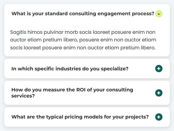
The Accordion component is based on Bootstrap Accordion and styled to match the theme.
Structure
Each accordion item follows this structure:
  <div class="accordion accordion-flush" id="accordionFlushExample">

    <!-- accordion 1 -->

    <div class="accordion-item main-card">
        <h3 class="accordion-header" id="flush-headingOne">
            <button class="accordion-button" type="button" data-bs-toggle="collapse" data-bs-target="#flush-collapseOne" aria-label="">
                Accordion Title
            </button>
        </h3>
        <div id="flush-collapseOne" class="accordion-collapse collapse show" data-bs-parent="#accordionFlushExample">
            <div class="accordion-body">Accordion Content>/div>
        </div>
    </div>

    ...

  </div>
Notes
- You can add or remove accordion items freely
- Make sure each accordion ID is unique
No JavaScript customization is required.
Customer Slider
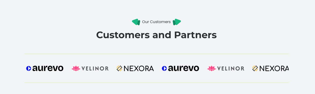
The Customer Slider is built with Swiper.js and displays client logos.
  <div class="swiper swiper-customer">
    <div class="swiper-wrapper">

        <!-- slides -->

        <a href="about.html" class="swiper-slide swiper-customer-item">
            <img src="assets/images/customers/customer-1.png" alt="customer logo">
        </a>
        <a href="about.html" class="swiper-slide swiper-customer-item">
            <img src="assets/images/customers/customer-2.png" alt="customer logo">
        </a>
        <a href="about.html" class="swiper-slide swiper-customer-item">
            <img src="assets/images/customers/customer-3.png" alt="customer logo">
        </a>
        ...
    </div>
  </div>
Features
- Infinite scrolling
- Responsive layout
Customization
- Replace logo images inside assets/images/customers/
- Add or remove slides freely
- Logos used in the demo are fictitious and for preview purposes only
Source & Credits
Preview Images:
- Unsplash - https://unsplash.com/
Fonts:
- Google Font - https://fonts.google.com/
- Icons Font - https://fontawesome.com/
Scripts:
- jQuery - http://www.jquery.com/
- Bootstrap - http://getbootstrap.com/
- Swiper Js - https://swiperjs.com/
- Isotope - https://isotope.metafizzy.co/
- Wow - https://wowjs.uk/
Other:
- Animate css - https://animate.style/
Support
If this documentation doesn't answer your questions, So, Please send us an Email
Don’t forget to Rate this template
Changelog
Version 1.0 (12 January, 2026)
Initial Release